Tuesday, January 11, 2011

Back to School! & Modular Design

I have been gone for a bit. Sorry about that. I had my little boy and he is a delight. For updates on my personal life...please feel free to check my family blog. DonTreader.blogspot.com
So Im back at school, with graphic design in full swing.
Im taking typography I (art 254) , 3D design (art 117) and Communication Design Studio (art 224).
So you will be seeing a lot of work from all of them. I like to try to document the process. 
So here Goes!
ART 117 Modular Design.
For this class...we needed to pick something that we can get in mass quantities. 
I chose the coffee bean.
I am hoping to make a coffee cup out of them.. and just see where it takes me.
Here is what I got done just in the 3 hour class I had today.


I started by glueing 2 beans together at a time. 
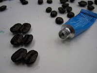


I used super gule gel...and had it all over me by the end of class.


After I got some grouping of two's I then did four's and used this bowl to get the shap I needed.


My first ring. Its a good start..now to fill in the center and start stacking them up.


Im starting to get a nice blow shape.
This is 3 rows up.


This is what I had after 3 hours..
Im not sure if I put more on my plate then I should.
This is 7 rows up.


This is going to take awhile...
and its due thursday.


Not to mention how fragile it is. 
How am I going to get it 
there on the bus?


Monday, December 8, 2008

Charity Water Project *Poster & Cards*

The other part of the project was to create awareness, and in order to do so, we as a class, decided to create posters and post cards.

I started with this drawing, but had not decided on what wording I wanted to use just yet. I like how its a gift, and water for some people is a gift and its something we take for granted.


Next I took my drawing and scanned it into photoshop and used it as a template to draw it in Illustrator. I also added text. I used this template to make a stencil for our postcards.


This is how my postcard turned out. I tried it with some different colors, but I liked the blue the best because of water.


I made a larger stencil for a hand made poster, but I printed off the font and just used the bow and bottled water to stencil.


And finally I used the file I created in illustrator for my digital file as well.


I liked my drawing the most because of the extra detail, but when you start thinking stencil that changes everything.


Instead of sending out a mass email, I created a group on facebook, and sent invitation out to all my friends. Check out my group. I used my digital poster too.
http://www.facebook.com/home.php?#/group.php?gid=38401394405

Charity Water Project *Chandelier* - part 2-

On our second workday we were able to finish up, minus how we were going to hang it, but it turned out nicely. We added more than we thought, but it was a good addition, and named it the Jellyfish Chandelier. Here are some final photos.


Close up of the spheres


Close up of the addition, to give it more of a cascading look.


And one with the lights out


I really enjoyed this project, I was glad to be doing something that was more hands on.

Charity Water Project * Chandelier*

So we decided that we were going to make a Chandelier out of empty Bottled Water containers.... We broke up into groups and brain stormed different chandeliers, and ways that we could use the materials we had. Finally, we decided as a class we would break up into groups, and make 3 different chandeliers. Here is what we got done on the first work day.


We cut the bottles, and used the middle of them to create sphere around each light.


For our structure we used an old bike wheel frame, the I got from a friend of mine, and lisa spray panited it a nice silver color.


After our first work day, we were able to cover all the lights, and decided we would need another string of lights to make have more coverage. Here is what our work got us to on the first day.


Its a great start, and now we know what we will need for next class, More water bottles, lights, and another coat of paint.

Tuesday, December 2, 2008

- Oscar Wilde - Final Thoughts

Below you will find the final ten pieces that I chose to go into our book. Overall, I like the ones I chose, but I also wish I had more time to think about this project and work through the thoughts I was having.

Again, I feel that the class focus on more beauty then corruption, which says something about either our class, or our society. If I could do this project again, and was in a place where I could handle the topic that I would choose, I think I would have focused more on corruption. I feel that because we showed our choices almost every week, the as a group we went with what the majority was doing rather than going with those ideas that we had.

Anyways, I would have done more of my compositions by hand, rather than photography, even though it is what I tend to go to. And I would focus on the war. From what I saw put up in class, my images were the only two that touched on the subject. So if I could create the images in my head, and have time to do so, I think that I would have chosen all of my composition to be about that.

So ideas I had were going to the VA hospital and talking with Vets, putting in images that I have when I think about the war and my fathers death. I have more information then I really need to know about how he died, and it could make for some interesting images.

Anyways, just some thoughts I have had after we finished this project.

- Oscar Wilde - FInal Choices Cont..


- Oscar Wilde - FInal Choices